Wednesday, March 14, 2012

SSRS - How to show a tablix inside a tablix

1.     Background

This article describes how we can show a tablix inside a tablix. Cascade tablix report is very useful in such cases where we need to show summary and detail data within the same report. One tablix can be used for summary data and another tablix can be used for detail data. The advantage of this kind of report is that we don’t need to create sub report to show detail data.

Let’s consider the below data for the article. Below table having information about Country, city and its population with respect to male and female:


2.     Steps to create cascade tablix report


                    I.            Create a data source that points to required server and database.

                  II.            Create a dataset having the below SQL query:

    SELECT * FROM Population

 Dataset output is same as above mentioned table.

Create a simple tabular report having two columns Country Name and Total Population:


               III.            The above report is simple report does not having any groupings. Now we will add a group for Country Name. For Grouping, Go to grouping paneè Row Grouping èright click on the Details groupè Group propertiesèGeneral tabè Group on should be “Country Name”è click.


                IV.            Now go to report layout and add sum function to numerical value(Population field):


                  V.            Preview the report. We can see all country names with total population. So this report is showing summary data for country and its population.


                VI.            Now create one more tablix using the same dataset that above report is using for showing detailed data:
              VII.            Preview the report. We can see first tablix showing summary data and second tablix showing detail data.

            VIII.            Go to Report layout è first tablixè right click on left most of the row è Insert rowè Insert Group below:


 It will add a new row to tablix within the same grouping:

                IX.            Merge the cells of newly created row:

                  X.            Right click on the second tablix, copy and paste on newly created row of first tablix. We can remove country column as it is already available in first tablix.


                      Preview the report:


                XI.            For better visibility, we can add drill down also. For adding drilldown,  right click on the row where second tablix is pastedèRow VisibilityèChange the display option – When the report is initially run to “Hide” and display can be toggled by Country Name textbox and click ok:


              XII.            Now preview the report. We can see the drilldown in the report. When initially report runs, it will show summary data:

            XIII.            For seeing the detail data, we can click on (+) sign :

3.     Conclusion


 We can show a tablix inside a tablix by inserting the tablix in any group of the parent tablix.

 ----------------------------------------------------End of Article---------------------------------------------------


Monday, March 12, 2012

SSRS - How to resolve the sorting issue with exported excel report by replacing report header with column header


1.     Background


The purpose of this article is to provide a way to resolve sorting issue in exported excel report due to improper report header. If report header is not properly aligned or having multiple textboxes may create sorting issue in the exported excel report. While exporting the report to excel, SSRS merges some of the cells of excel in order to maintain the report format.


Fig1. Showing excel report having merged cells

Due to this merging of cells, user will not be able to sort the column data and will get the below error:


2.     How to resolve the sorting issue with exported excel report?      


We can resolve this issue by removing the report header and add all the contents of report header to column header with proper alignment.

3.     Steps to resolve the issue


                    I.            Go to the report layoutè right click on left most part of column header of the tablixèInsert Rowè Above


                  II.            It will create a row above the column header:


                III.            Expand the width and height of the new column header as per report header contents and then merge all the columns of the newly created column header:


                IV.            Add the contents of report header to newly created column header including all text boxes. Try to adjust length & width of columns in such a way that it should change the look and feel of the report:


                  V.            Now preview the report:

 Report looks fine but we need to check whether we are able to sort the data or not in exported excel report.

                VI.            Export the report to excel and check whether we are able to sort the data or not:
 Exported Report:


Sort the data by Year:


Sort the data by region:

4.     Conclusion


Sometimes, due to report header layout, we experience sorting issue within the exported excel report. This issue can be resolve by replacing the report header to column header.

----------------------------------------------------End of Article---------------------------------------------------


Tuesday, March 6, 2012

SSRS - How to repeat the column header in each page of the report


1.     Background

The purpose of this article is to provide a way to display column headers on each and every page of the report. By using the page break feature of SSRS, we can show the report in no. of pages in place of having same report in single page. Page break is very useful with bulky report where large no. of records need to be shown. Page beak helps us to set pagination but it does not ensure that column headers for the report should come on each page of the report. A report without column headers in all the pages may create lot of confusion to the users.

2.     How to display column headers on each page of the report?   


We can achieve it by using the “KeepwithGroup” & “RepeatOnNewPage” properties of the grouping pane.

 Below is a simple report having 10 records:


After implementing the page break for 5 records per page, Report will look like the below one:

Page No-1


 Page No-2


3.     Steps to display column header on each page of the report


                    I.            Go to the Grouping paneè there we can see a down arrow, click on the arrow to go to Advance mode


                  II.            Once you click on the “Advance Mode”, we can see the static members for rows & columns within grouping pane.


                III.            Select static member of Row Groups and go to the property window. We need to change the below properties:

·         KeepwithGroupè After

·         RepeatOnNewPageèTrue


Note:
KeepwithGroupèAfter for Group Header

KeepwithGroupèBefore for Group Footer


                IV.            Now preview the report


Page-1


Page-2
 

4.     Conclusion


By using advance mode properties of Grouping pane e.g . “KeepwithGroup” and “RepeatOnNewPage”, we can display column headers on each page of the report.

 ----------------------------------------------------End of Article---------------------------------------------------

Monday, March 5, 2012

Representation of Geographical Information using SSRS 2008 R2

1.     Background


The purpose of this article is how to design a Map report in SQL Reporting Service environment to represent geographical information. As we know that a Map is a visual representation of an area—a symbolic depiction highlighting relationships between elements of that space such as objects, regions & themes. Below is an example of map showing location of various cities of India:


2.     How maps are design by Cartographers?       

     As per the Geography, our earth is divided into various sections by two important lines called Longitude & Latitude. Lines of Longitude appear vertical with varying curvature; it   starts from North Pole to South Pole. Lines of latitude appears horizontal with varying curvature, it starts from east to west of the globe. Cross section of these lines helps us in locating the place. Below is an image of globe with longitude & latitude:


Fig.2 Showing the Globe with Longitude & Latitute.


 We have to go with the same concept in SQL Server Reporting Services for creating a map. For creating a map, we need Geo-Spatial data containing longitude & latitude   coordinates information. E.g. POINT (-89.5775825539, 35.4749083474)

3.     Step by Step procedure to create a map in SSRS

      
           Here I am going to create a simple map report with the help of map gallery available in     
                SSRS 2008 R2.

a.      Create a DataSource for Geospatial data

There are three options for selecting a data source for geospatial data:
·         Map Gallery: Once we installed the SSRS 2008 R2, Map Gallery by defaults installed in the system. Now Map Gallery basically contains Maps of USA by States, Cities….
·         ESRI shapefile: This file is compiled by Environmental Systems Research Institute Inc (ESRI). To retrieve spatial data dynamically at run time, upload the Shapefiles to your report server, and then specify them as the source for spatial data. ESRI shapefiles are available on the Web from a variety of sites.

·         SQL Server spatial data stored in a database: We can use the T-SQL query as data source to return geo-spatial data.
Here we are designing a map with Map Gallery available in SSRS 2008 R2.
                              i. For creating a map, right click on the layout region of the  reportèInsertèSelect  Map:


                               ii. Once we choose Map, It starts the map wizard and asks for choosing data ource for spatial data.


                              iii. Here we are going to design the map by using “Map Gallery” available in    SSRS 2008 R2. Select the “Map Gallery” option as spatial data source. Let’s select “USA by States Inset” from the gallery. We can see the map in the right side for “USA by States Inset”. Click next.
                             iv. We can change the view, resolution, and size of the map as well as we can add the “Bing Map layers” to the map.
If we add the Bing Map layer to the report, it will show the map as it is available in Bing.

Note: for this exmaple, we are not adding Bing Layer.
Click Next

                               v.  Next step for choosing the data visualization for the map.
                               

There are basically three types of data visualizations available for the map.
·          Basic Map: A Basic map is use to show the location only. We can vary the colors of the areas on the map by shade, but the color does not represent analytical data values.
·          Bubble Map:  In Bubble map, bubble size conveys the relative value for a single analytical data aggregate, for example, city population. You can create bubble maps for either polygons or points. For polygons, set the polygon center point properties; for points, set the marker properties.
·          Analytical Map: An Analytical map conveys the relative value of one or more analytical data aggregates for each map element. For example, store sales as marker size, profit range for product categories as marker color, and top selling product as marker type.

Select Basic Map and click on Next.
                             vi. Here we can choose color theme and data visualization like whether we want single color or multiple color maps; label should show or not etc. Click Finish to     complete the wizard.
   
               
                            vii. Here you can see the map in report layout; you can add the map title etc.

                          viii. Preview the report to see the map:

4.     Step by step procedure to add a layer to map report


                                 i. For adding a layer to the existing map report, click on Map Layerè New Layer Wizard

                               ii. It will start the new Map Layer wizard. Here we are going to SQL Server as spatial data source. Choose SQL Server spatial query and click Next
                              iii. Now wizard will ask for choosing the dataset with spatial data. You can choose either existing dataset or new dataset based on the condition.

           Let’s choose “Add a new dataset with SQL Server spatial data” click Next

                             iv. If you have any published data source then you can use that as DataSource or click on New

                               v. Click on edit and give the required connection string for the data source. Here we are using AdventureWorks2008R2 database because this database has few tables in which spatial data is available.


                             vi. Once the DataSource created, Execute the query in the query designer to check whether data (Spatial data) is coming correctly or not and click next.

           Below is the query that we are using for getting cities name & their geospatial
           information of USA:
SELECT 
      S.BusinessEntityID,
      A.City AS name,
      A.SpatialLocation
FROM Sales.Store S
      INNER JOIN Person.BusinessEntityAddress BEA
            ON S.BusinessEntityID = BEA.BusinessEntityID
      INNER JOIN Person.AddressType AT
            ON BEA.AddressTypeID = AT.AddressTypeID
            and AT.Name = 'Main Office'
      INNER JOIN Person.Address A
            ON BEA.AddressID = A.AddressID
      INNER JOIN Person.StateProvince  SP
            ON A.StateProvinceID = SP.StateProvinceID
      INNER JOIN Sales.SalesTerritory  ST
            ON SP.TerritoryID = ST.TerritoryID
      INNER JOIN Person.CountryRegion CR
            ON ST.CountryRegionCode = CR.CountryRegionCode
WHERE CR.Name = 'United States'
Here we can see geospatial data from SQL query:


                            vii. Next step is to choose the Map view whether we want to show information on map as Polygon, Points or lines. We are going to select Points as Layer type for this example:
                               
                                Here you can increase or decrease the size of map as well as you can move  
                                 the map to any direction by using the direction arrows. Click Next.
                               
               
                          viii. Next step for choosing the data visualization for the map.
                               

         Select Basic Map and click on Next.
                             ix. Select the theme/ Marker /labels for the Map and click on Finish.


                               x. Once we have created a map report, we can preview the report. We can see the Map (USA by  States) with the layer of some of the cities
           
We can include parallels or meridians in the map.
Map with Meridian lines:


Map with Parallel and meridian lines:

5. Sub Report with Map

            It is possible to use sub report with the Map. As we have created a Map that shows all the          states of USA with the cities (D) belong to that states. If we want to show more detail report           about a city then we can use sub-report for detailed report.
                For example: if we want to show all the stores available in the city and their total sales
                amount. Let’s see how we can achieve it by using sub-Report with Map.
·   I have created a sample tabular report named “Store Sales Detail Report” for showing detail information about the stores based on the city.
Dataset for the Report:
            SELECT
                  Name,
                  City,
                  TotalSales
            FROM StoreSalesDetail  
WHERE City = @City
Note : StoreSalesDetail table contains information about all the stores of USA,their SalesAmount with respect to cities.
So city is the input parameter for the report:
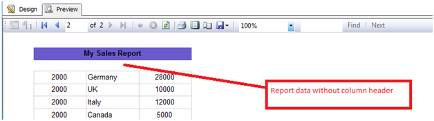
Fig. shows Detail report that will be use as sub-report
·  Now go to the map report layout and click on the any city (D) in the map:
·  Right click on the PointerèPointer propertiesè


·     Go to Actionè”Go to Report”èSpecify a reportèselect the report name “StoreSalesDetailReport” and select the parameter city and map the city parameter with Map report dataset so that sub-report will always take value of city from the map report itself once we click on the city (D):


·  Preview the Map Report:
So the below map report showing states of USA & cities within the states.

·  If you want to view the detail report about a city e.g how many stores are available in the city & their sales amount then click on any of the city (D) e.g. Memphis. It will automatically redirect to “Store Sales Detail Report” for Memphis.


·  Once you click on the any city (D) e.g. (Memphis) to view detail report. It will automatically redirect to “Store Sales Detail Report” for the selected (Memphis) city. Below is the Sub-Report (Detail Report):

6.     ESRI Shapefile

                ESRI shapefile is a file that contains geospatial data for the geographical locations.           
                The extension of the shalefile is .shp.  Below is the link from where we can download
                shapefile for world, continents and all the  countries
                http://www.vdstech.com/map_data.htm

7.     Conclusion

SSRS 2008 R2 has provided a simpler way to create various types of map to show geographical information. Spatial data from SQL Server, ESRI shapefile, Map Gallery, Bing Maps are the good source of getting the spatial data for creating the maps.

----------------------------------------------------End of article---------------------------------------------------