
1. Background
The aim of the article is to describe
a way of adding data bars in the report to make report more interactive.
2. What is Data bar?
- Data bars are small, simple charts that convey a lot of information in a little space.
- Data bars are often used in table and matrices.
- Data bars can represent multiple data points, but typically illustrate only one.
- Data bars usually depict single value in a cell.
- We cannot add a data bars to a detail group in a table.
- Data bars do not have any category group. It will have only series grouping.
Types
of Data bars:
3. Steps to add the Data bar in the report:
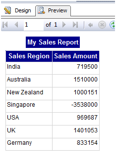
Below
is the sample Sales report which shows year
wise sales amount for various regions:
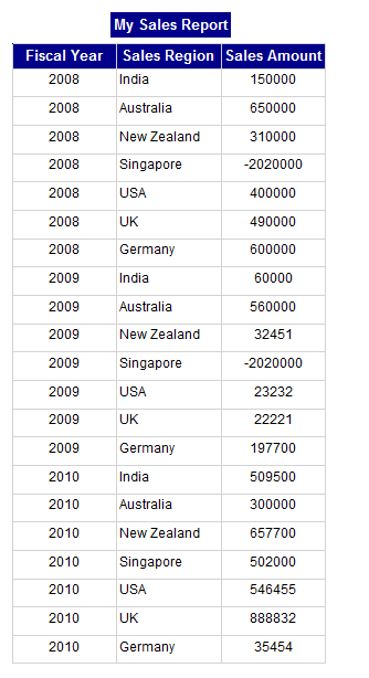
We will add data
bars into the above report to show year
wise sales amount for regions.
I.
Go to report layout and remove FiscalYear
column from the tablix:
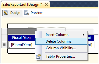
After deleting column,
report is having only two columns:

II.
Preview the report:
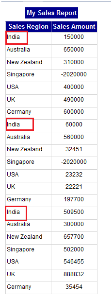
Here we
can see that Sales Region is repeating as we have deleted the fiscal year
column so we can group the data by Sales Region to avoid duplicate records.
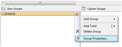
III.
To create a group for SalesRegion, click on
Details group in Row Group pane and select Group Properties:
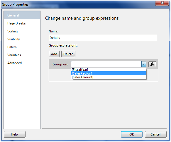
IV.
It will show the Group Properties:

V.
Click on “Add” button and select “Sales
Region” and click Ok:
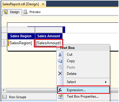
VI.
Now go to tablix and right click on SalesAmount text box and select
expression:
VII.
It will open the expression builder, add
the SUM function to sales Amount:
=SUM(Fields!SalesAmount.Value)
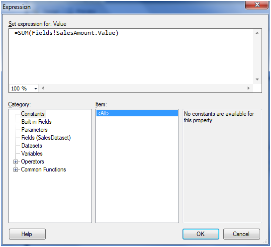
Click Ok.
VIII.
Preview the report. It will show the
aggregated Sales Amount for SalesRegion:
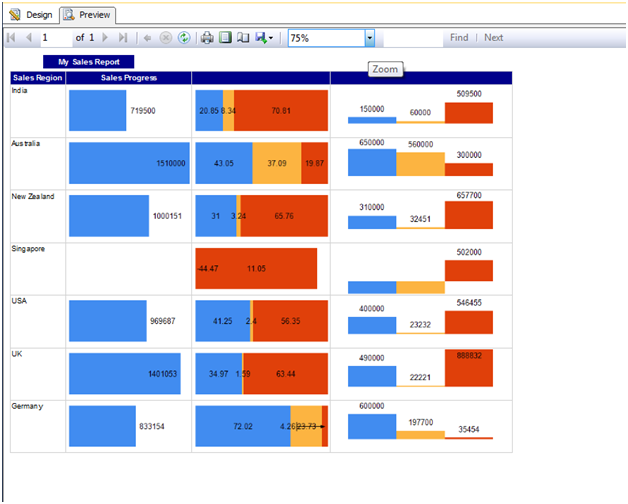
Now we can see the report showing region
wise aggregated Sales Amount.
Note: Now we will add the data bars to show
progress of Sales Amount.
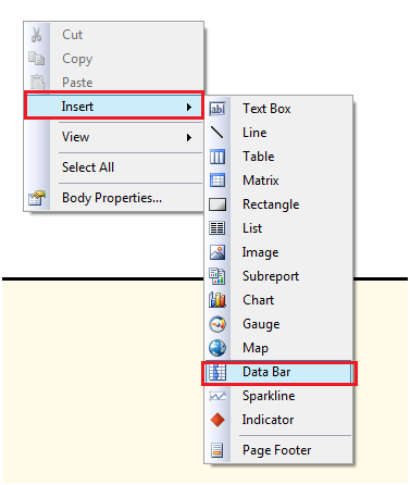
IX.
For adding Data bar, right click on Report
layout then Insert and select Data bar:
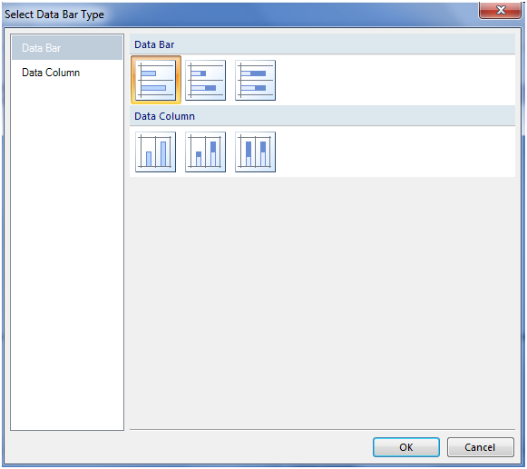
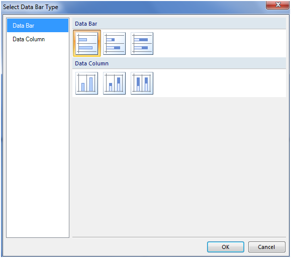
X.
Select the data bar type:
It will show the Data bar in the report
layout:

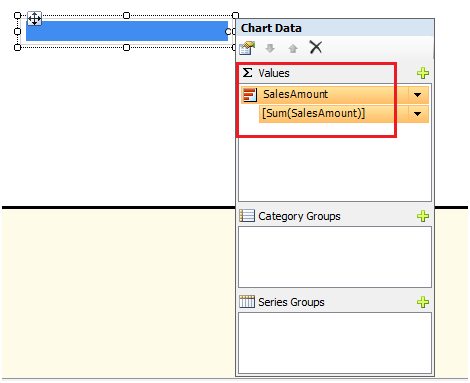
XI.
Set the property for Data bar:
·
Value – SalesAmount
·
Series – Not required
·
Category Group – Not required because we already grouped data
into tablix by Sales Region
XII.
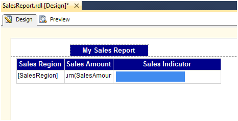
Now add a new column into a tablix named
SalesIndicator. Drag and drop the Data
bar into this newly created column:

XIII.
Now report layout looks like below one:
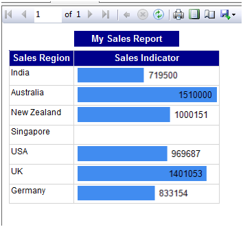
XIV.
Now run the report and see whether we are
able to see the sales amount progress or not:

Report is
showing sales amount Indicator.
XV.
We can add data label to Data bars. Right
click on the data bars and select “Show Data Labels”:

Now we can remove the
SalesAmount column as we are showing Data labels in the data bar itself.
XVI.
Preview the report
Now report is showing with data labels.
XVII.
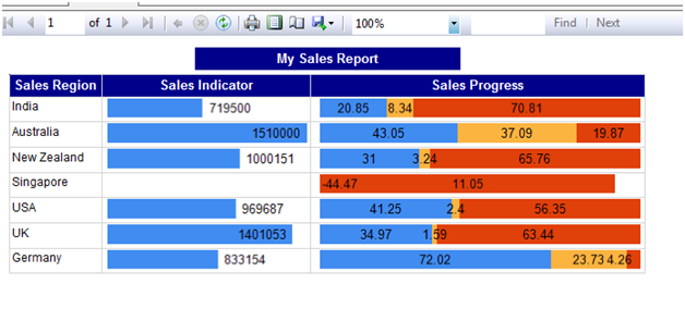
Now we will add another data bar to show
Sales Progress over years, Add a new column named Sales Progress and add a data
bar into this newly created column. Set the Below property:
·
Value
: SalesAmount
·
Series : FiscalYear

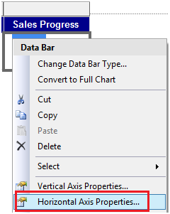
XVIII.
Go to the property of the Data bar and set
the horizontal axis range in such a way that it should show negative values
too:
XIX.
Preview the report:
XX.
Now we will add one more data bar (Data
Column)
Repeat
the same steps as we did for Sales Indicator column:
XXI.
Below is the report after adding Data
column also in the report:
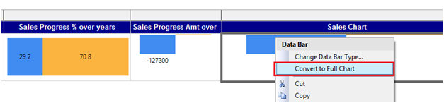
4. How to change Data bar to Chart
I.
For Changing data bar to Chart, add a new
column to the tablix and copy and paste one of the already created data bar to
the newly created column. Then right click on the data bar and click on
“Convert to Full Chart”
II.
Preview the report:
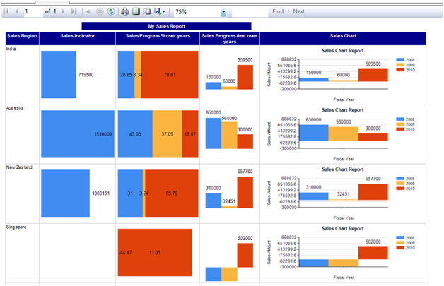
Now report is showing with Chart.
Note: We can directly add
Chart also to tablix.
5. Conclusion
By using the above steps, we
can show implement Databars and Chart in the tabular report.
----------------------------------------------------End
of Document---------------------------------------------------
Aivivu chuyên vé máy bay, tham khảo
ReplyDeletegia ve may bay di my
chuyến bay cứu trợ mỹ về việt nam
vé máy bay giá rẻ nhật việt
khi nào có chuyến bay từ đức về việt nam
ve may bay tu canada ve viet nam
mua vé máy bay từ hàn quốc về việt nam
khách sạn cách ly tại hà nội