
1. Background
This article describes how to implement Gauge data region
in the report. Many Dashboard and Score Card reports require colorful
indicators to show quantity, population, productivity etc. Gauge is one of popular data region of reporting services that acts like a measuring instrument in the report. It makes report more interactive and helps the business users to understand the data more easily.
2. What is Gauge Data Region?
The Gauge data
region is a one-dimensional data region that displays a single value in your
dataset. We can use gauges to perform many tasks in
a report:
·
Display key performance indicators (KPIs)
in a single radial or linear gauge.
·
Place a gauge inside a table or matrix to
illustrate values inside each cell.
·
Use multiple gauges in a single gauge panel
to compare data between fields.
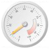
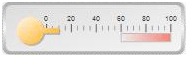
There are two types of gauges: radial and linear.
Radial
Gauge:
Linear
Gauge:
3. Steps to implement Gauge data region into report:
Below is the simple
report in which we will add Gauge data region for population data:

I. Here we will add Gauge for the city population to the right side of the Population column. For adding a new column,
right click on the Population column then Insert column and select Right. It will insert
a new column right to Population column.

Newly Added column is shown below:

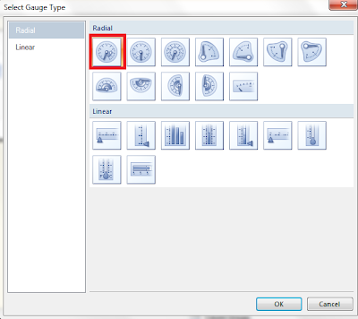
II.
Right click on the report plan, click on
Insert and select Gauge:

III.
Select a Radial Gauge. It will insert the
gauge data region:
Here we can see the gauge data region in the report layout:

IV.
Double click on the Gauge and map gauge
data to City_Population column of
the
dataset:

V.
Below screenshot showing Gauge mapped to
City Population.

VI. We can adjust the scale range based on our
data. Here we are working on population data and all the cities in report
having more than 2 lakh records. So setting the Below scale range:
Minimum: 200000 and Maximum: 15000000
For
adjusting the scale range, right click on the Gauge Scale and click on Scale
properties:

Note: We have changed the Gauge pointer color to red for better visibility
Below is
the screenshot for Radial scale properties:


IV. Give some name to new column e.g Population Indicator. So
final Report layout looks like below screenshot:

V. Preview the report and see whether Report is showing Gauge Indicator with respect to city population or not:

4. Conclusion
By using the above steps, we
can implement gauge data region in the report to make report more interactive
that is very helpful for users to analyse the data easily.
----------------------------------------------------End
of Document---------------------------------------------------
You might want to know that several of your articles have been stolen, including this one. (see http://basireddysubbareddy.blogspot.com/2013/06/how-to-add-gauge-data-region-in-report.html)
ReplyDelete